MUSE Magazine Redesign
Publication Merger & Redesign
Editorial Identity Refresh
Editorial System Redesign
Department Architecture
Feature Design System
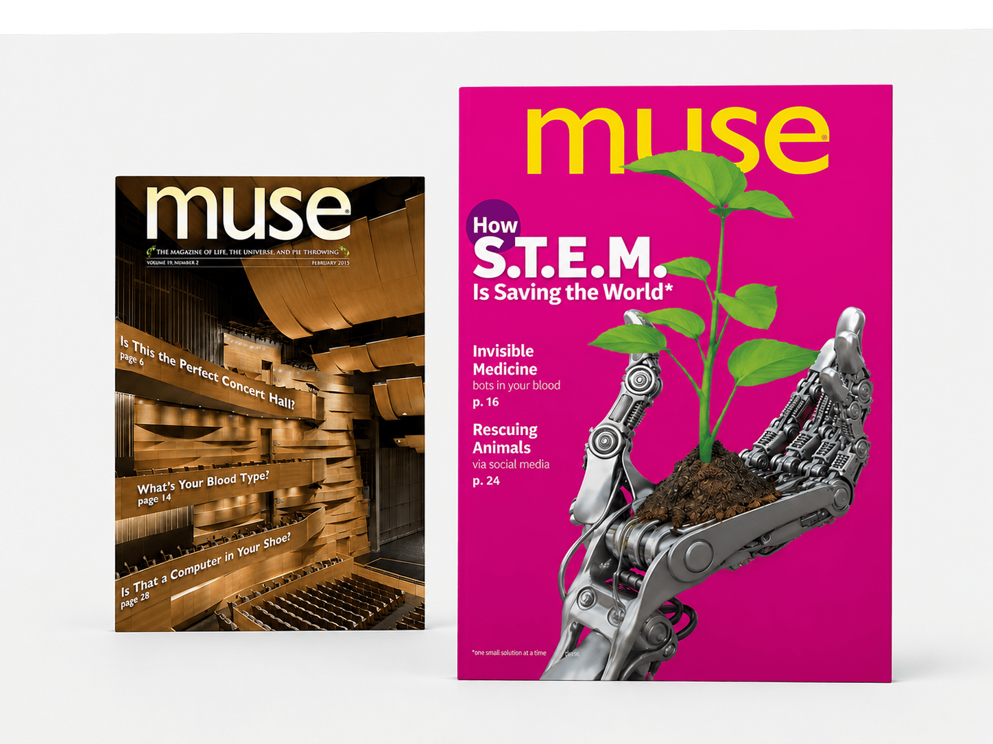
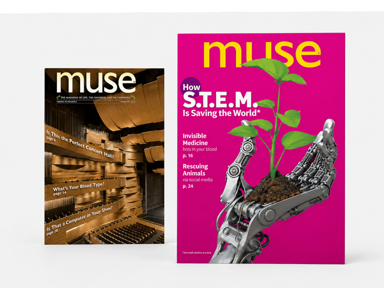
BEFORE

AFTER
Following a publication merger, MUSE required a complete redesign that unified multiple editorial systems into a single visual identity. The redesign modernized the cover strategy, feature architecture, department structure, and reader navigation while preserving the magazine's educational mission.
Five publication transformations, including two major magazine mergers, resulting in 21 Gold and 2 Silver Parents' Choice Awards.
250+ issues • 200+ covers • 21 Gold Awards
Additional Editorial Redesign Projects
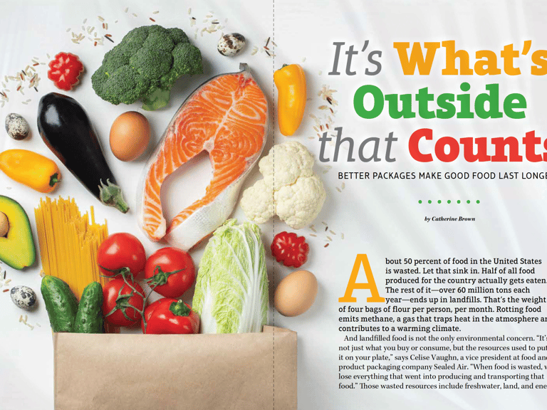
Modernized the cover system through stronger visual hierarchy, expanded imagery, and a more contemporary masthead treatment designed to increase engagement and improve shelf impact.
Rebuilt the table of contents, navigation, and editorial architecture to improve content discovery while establishing a clearer visual hierarchy across departments and features.
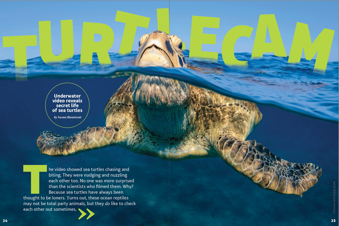
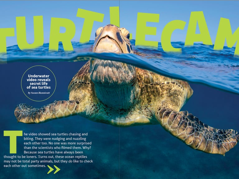
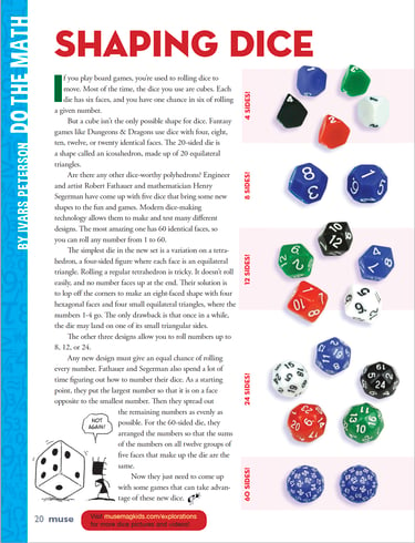
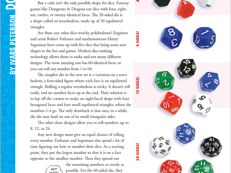
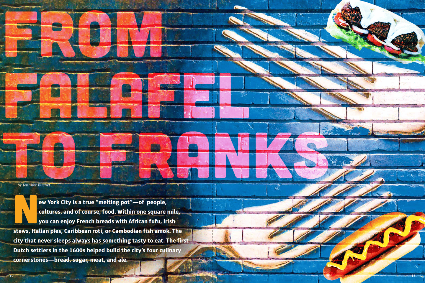
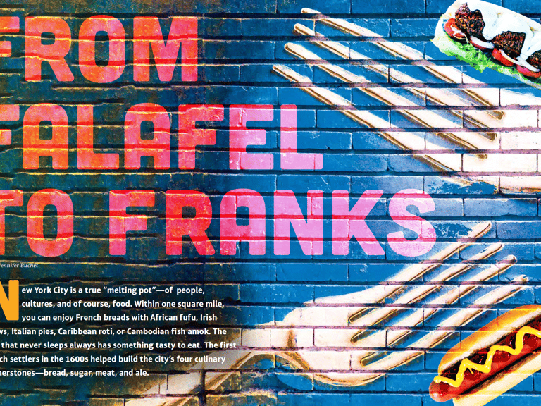
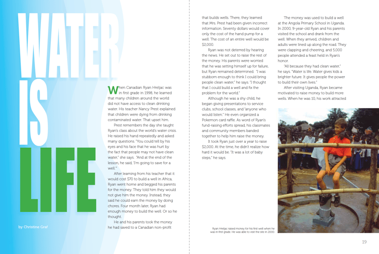
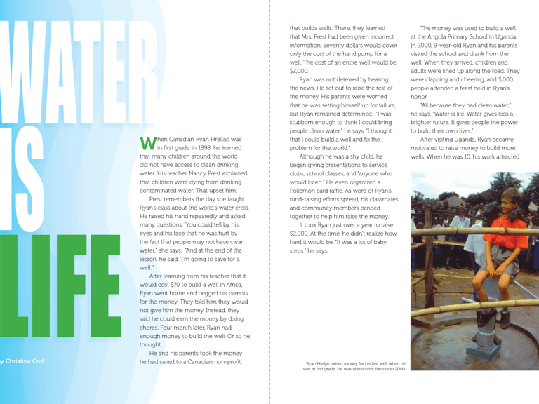
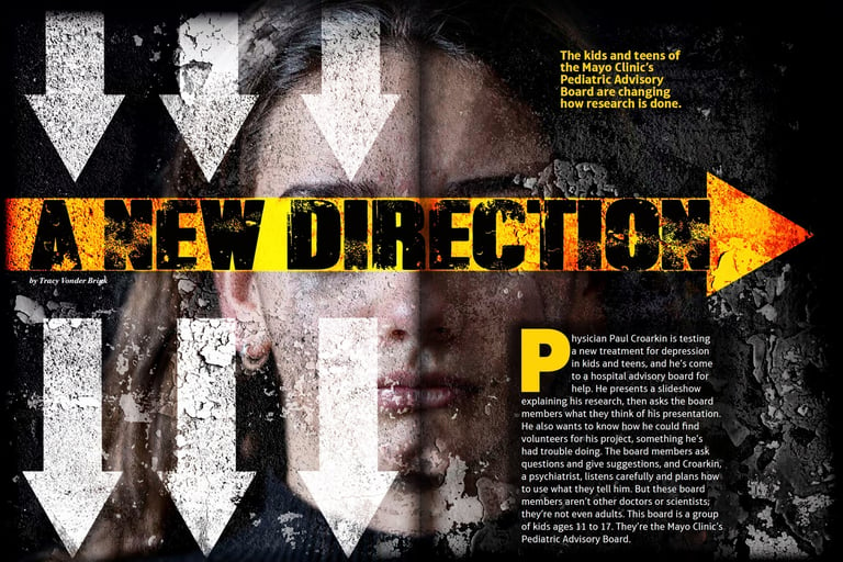
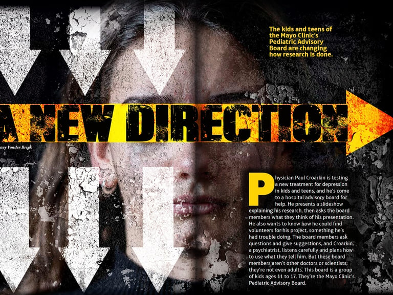
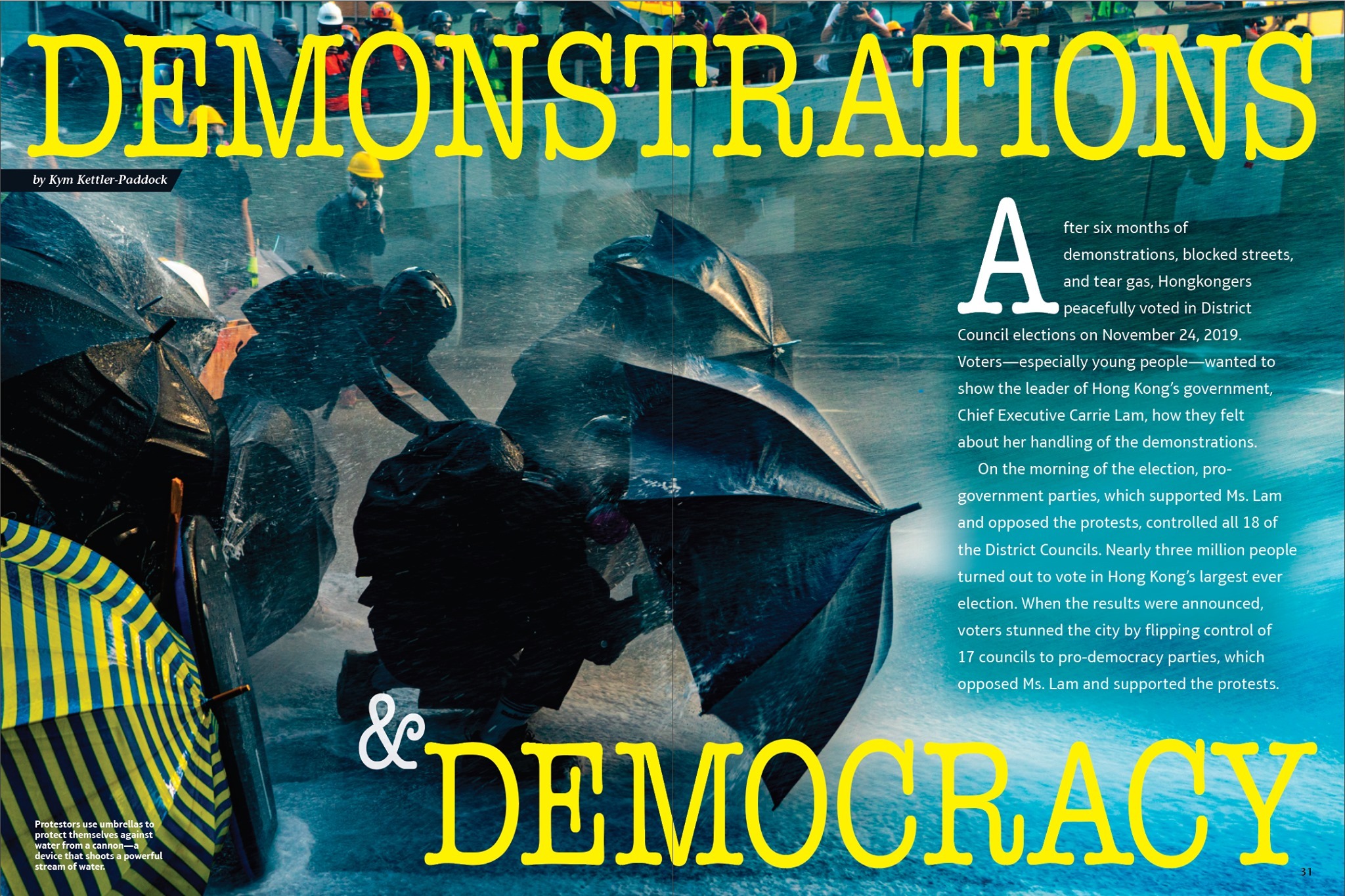
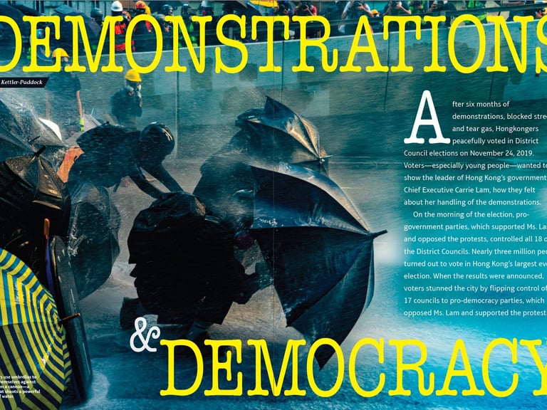
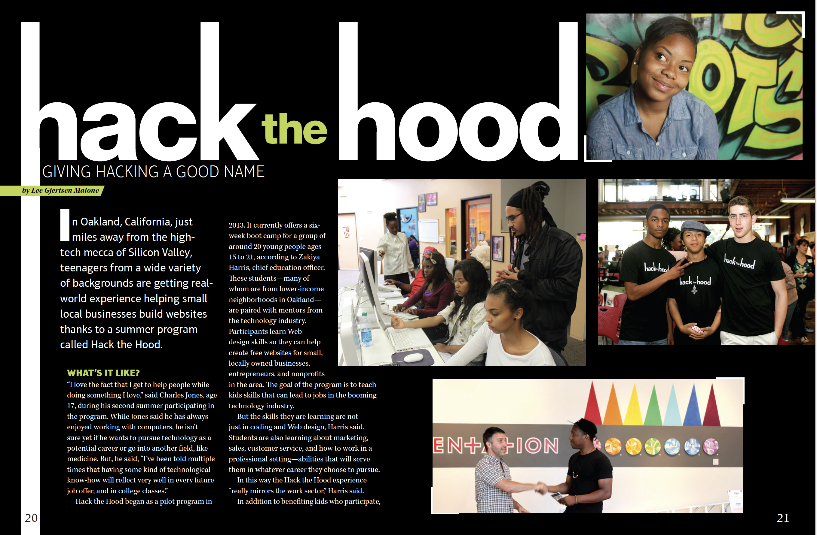
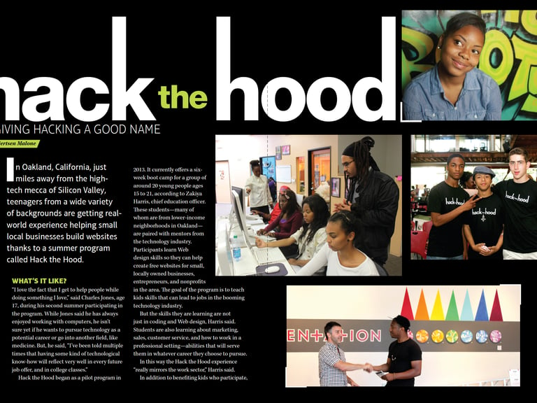
Developed a flexible feature framework that supported photography, illustration, and custom art direction while creating more immersive storytelling experiences.
Art-Directed Illustration
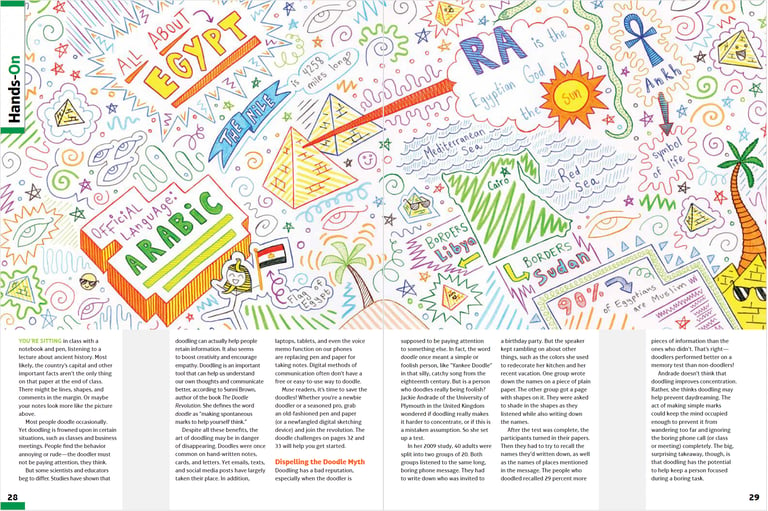
Standardized recurring departments through consistent layouts, navigation cues, and visual frameworks that improved usability while allowing for varied content themes.
System Applied Across Diverse Editorial Topics
Commissioned Artist Collaboration
Conceptual Typography & Visual Storytelling
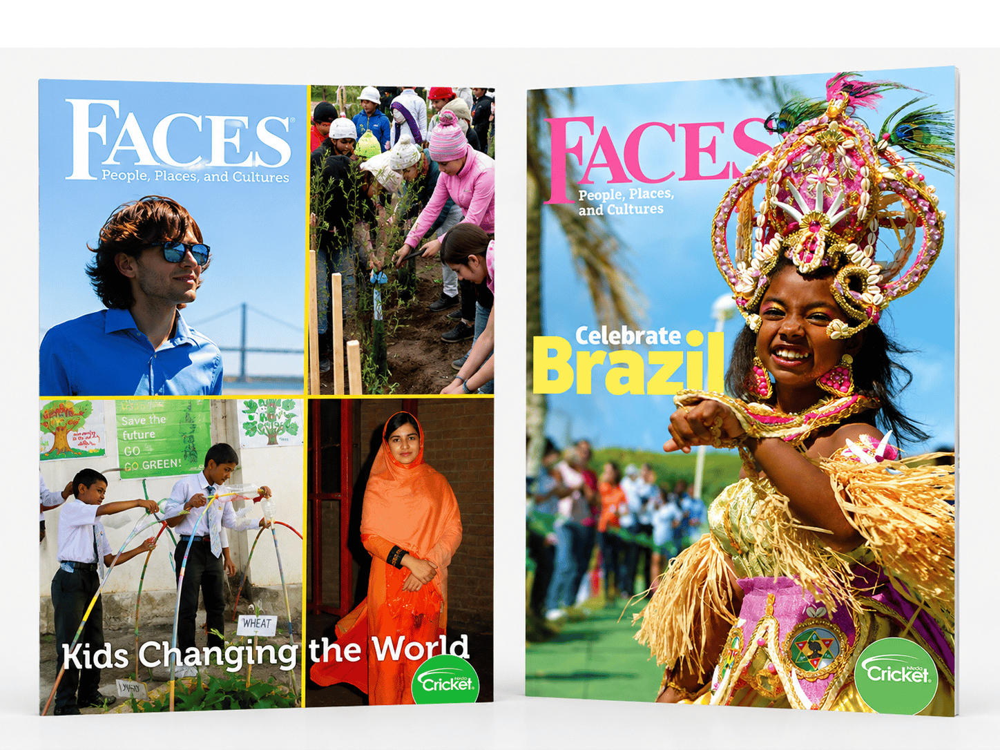
FACES Magazine Redesign
Editorial Refresh & Redesign
Editorial Identity Refresh
Led the redesign of FACES, developing a modern editorial system that strengthened reader engagement while supporting diverse cultural, historical, and global topics. Updated typography, feature design, and art direction created a more cohesive and visually compelling publication experience.

Before
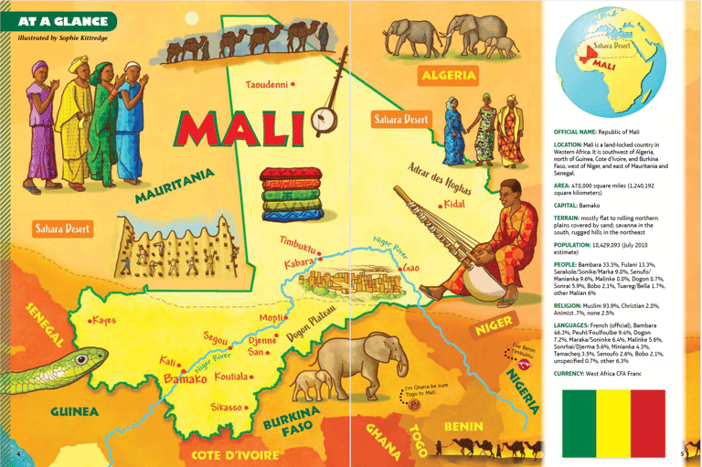
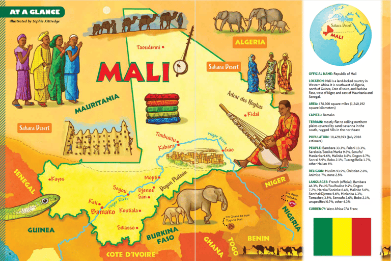
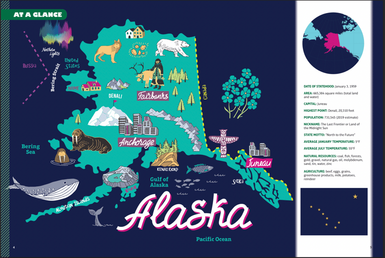


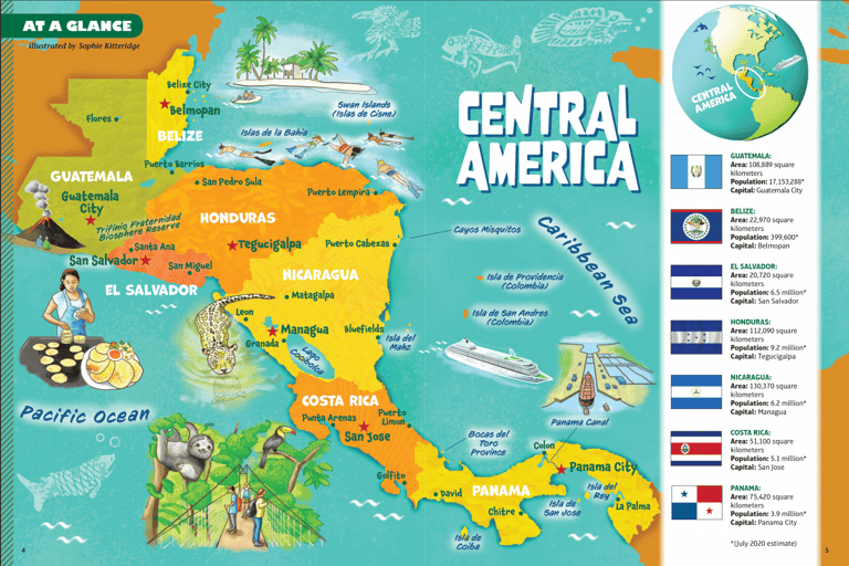
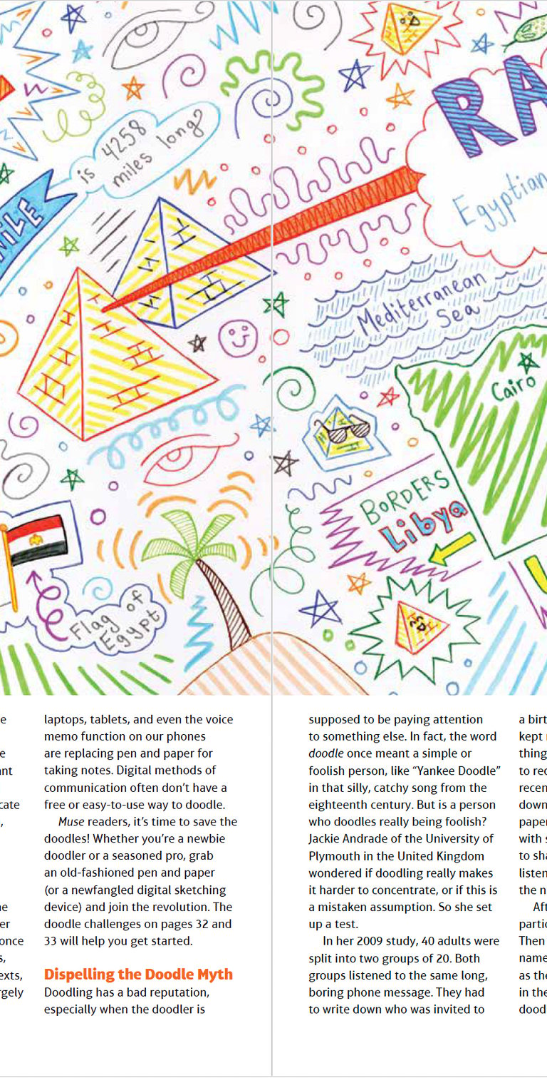
Educational Map Series
Developed a recurring educational map program that translated geographic and cultural information into accessible, visually engaging learning experiences.
AFTER
Before
AFTER
Before
AFTER
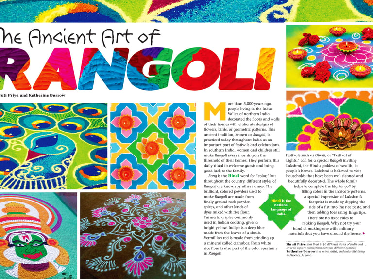
Reimagined editorial feature design through bold typography, immersive visual storytelling, and art-directed imagery that transformed educational content into more engaging reader experiences.
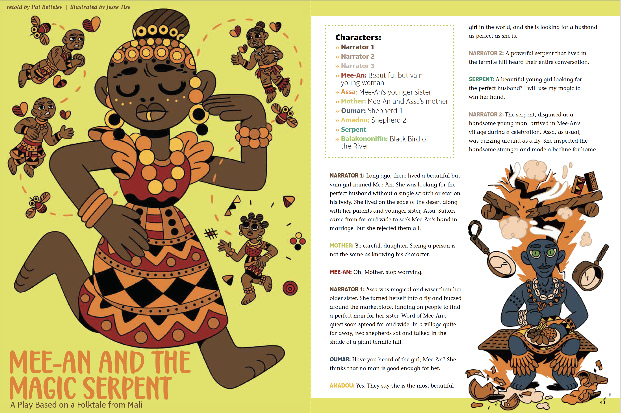
Editorial Illustration & Narrative Design
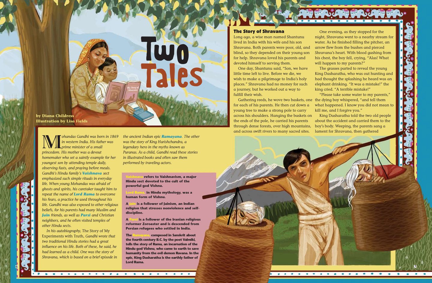
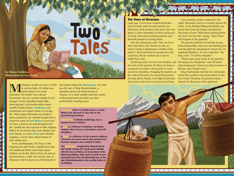
Directed illustrated editorial features by collaborating with artists to transform cultural stories into engaging visual narratives while maintaining a cohesive publication identity.
Art directed recurring activity-based features that encouraged reader participation through illustration, storytelling, and interactive learning formats.
Interactive Learning Features
Before
After
Before
After
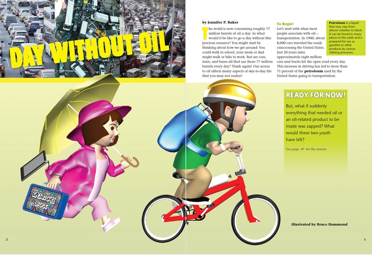
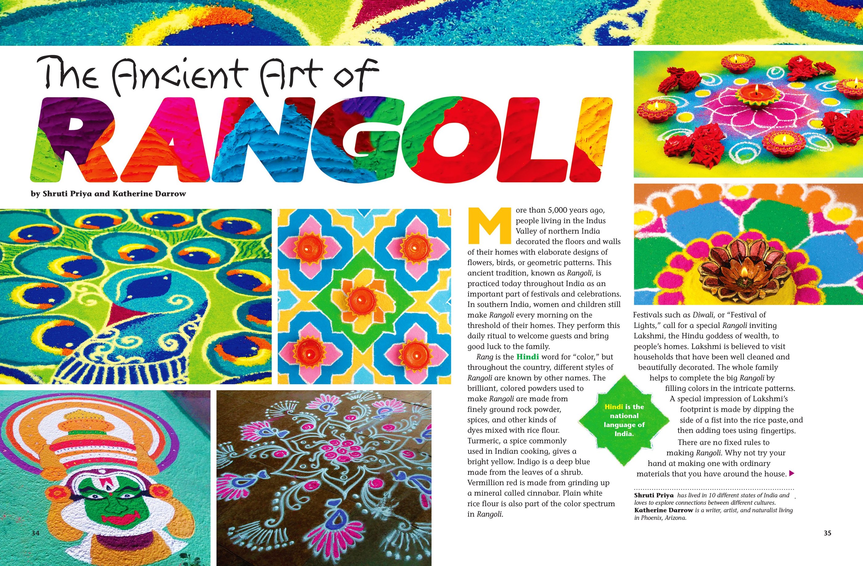
Applied the redesigned feature system across science, culture, history, and current events through art-directed illustration, commissioned artwork, and concept-driven visual storytelling.
Modernized the cover architecture, typography system, and visual hierarchy to create a more contemporary editorial identity and stronger reader engagement.
Feature Storytelling System
MALI
ALASKA
Central America
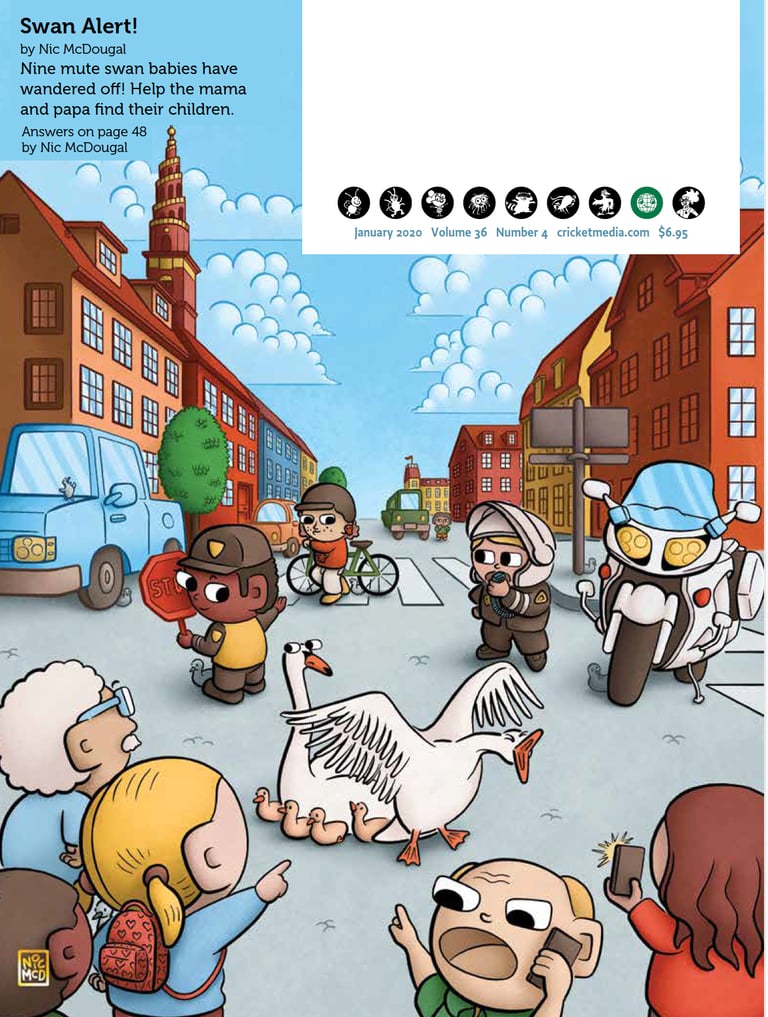
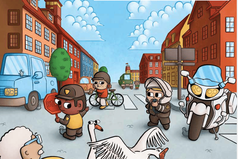
Swan Alert
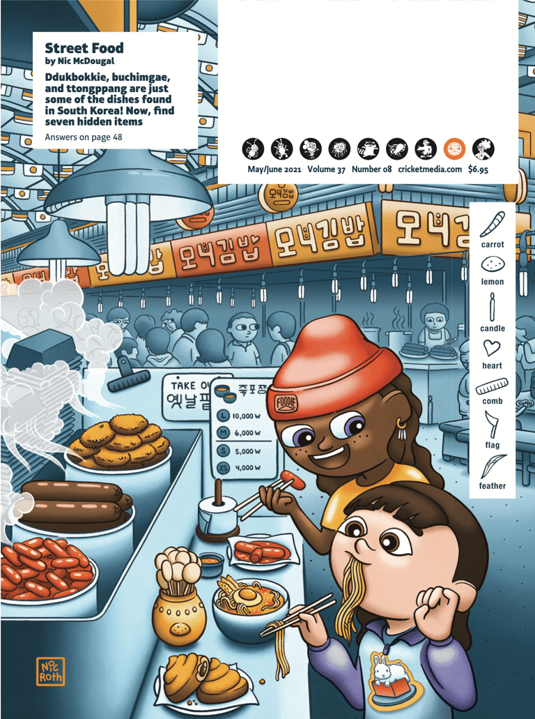
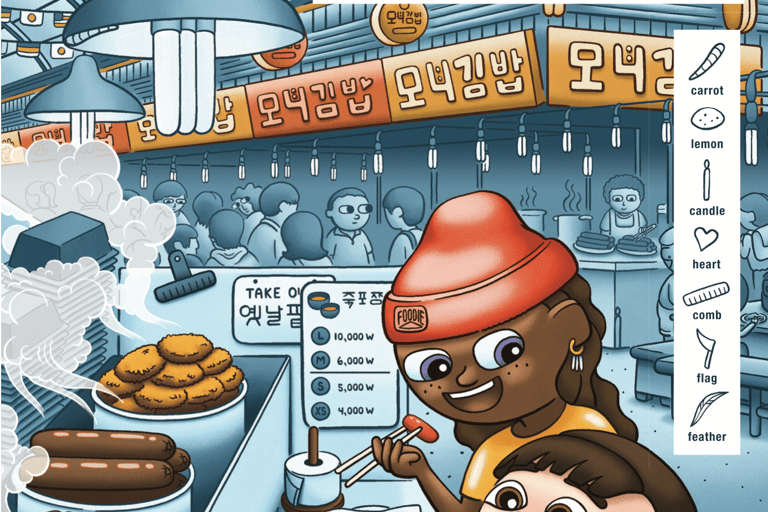
Street Food
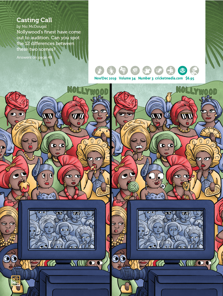
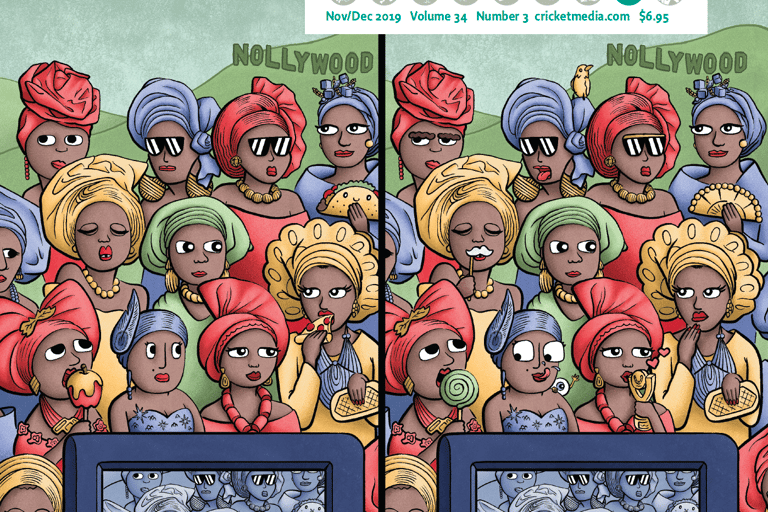
Casting Call
PUBLICATION REFRESH & EDITORIAL MODERNIZATION
CALLIOPE Magazine Redesign
Refreshed Calliope's visual identity by modernizing cover architecture, strengthening feature storytelling, and expanding the use of custom illustration and photography. The updated system improved readability, engagement, and visual consistency while preserving the publication's educational mission.
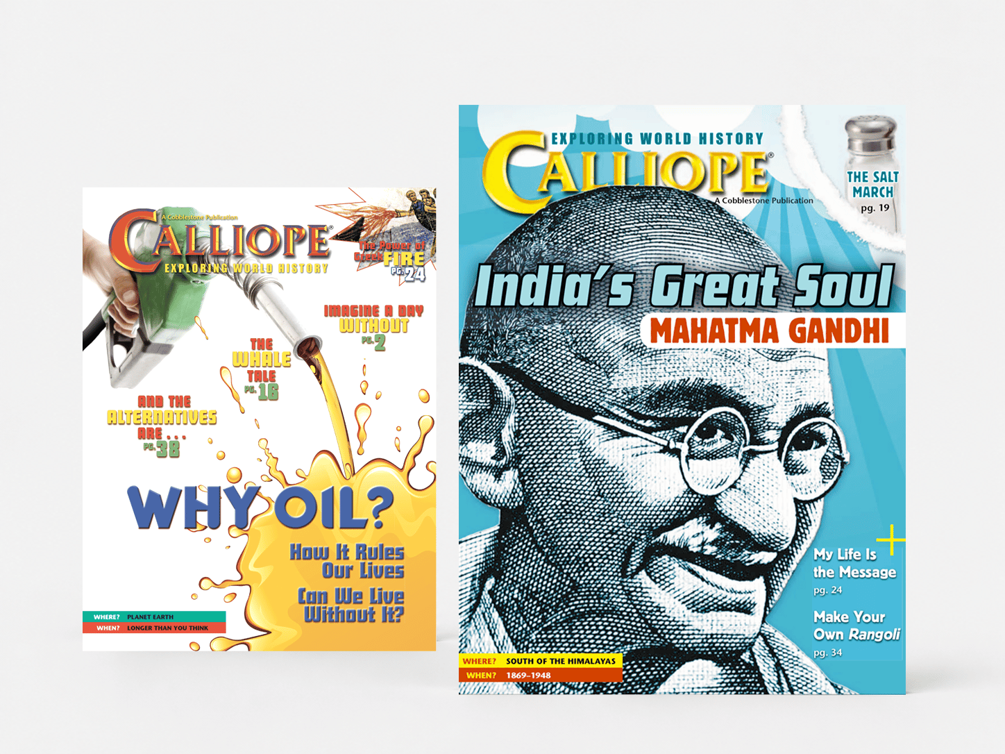
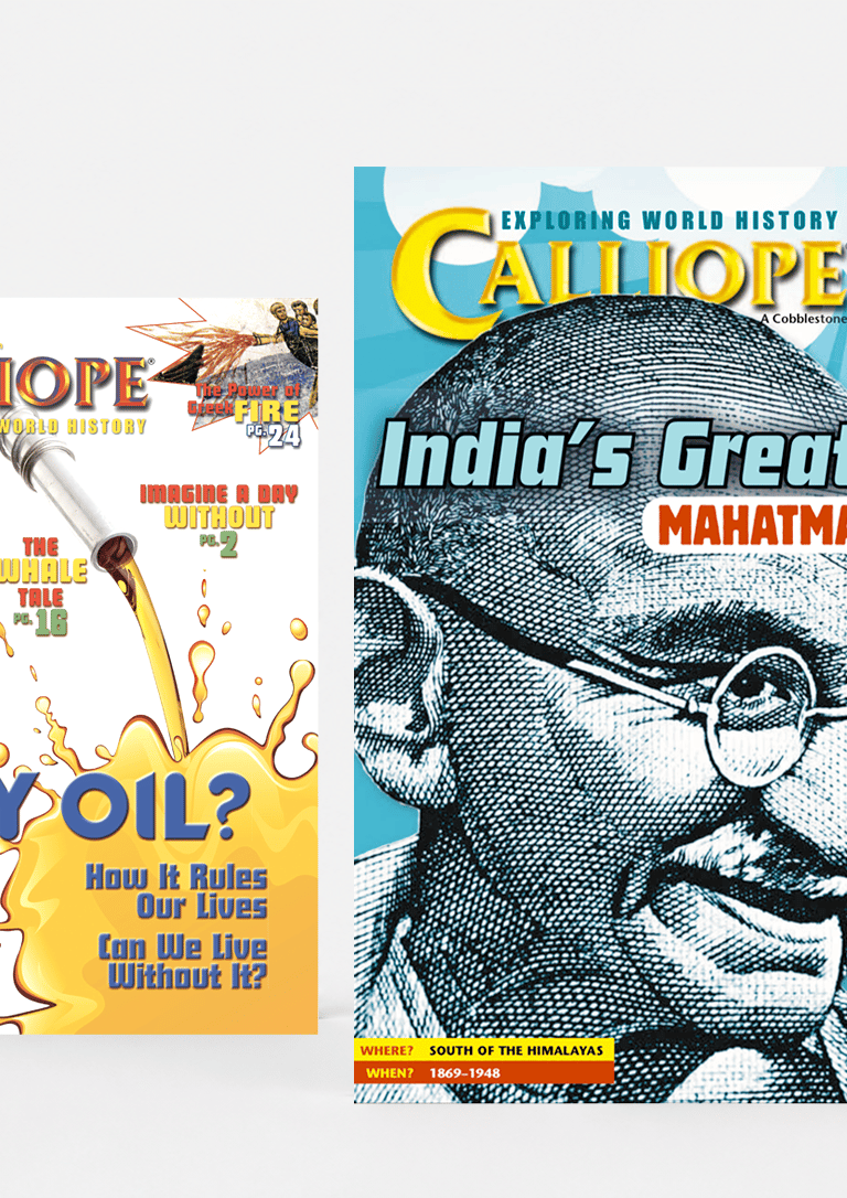
AFTER
BEFORE
Cover Architecture Refresh
Simplified the cover hierarchy by reducing competing headlines, establishing a clearer focal story, and creating a more recognizable visual structure that improved newsstand impact and reader navigation.
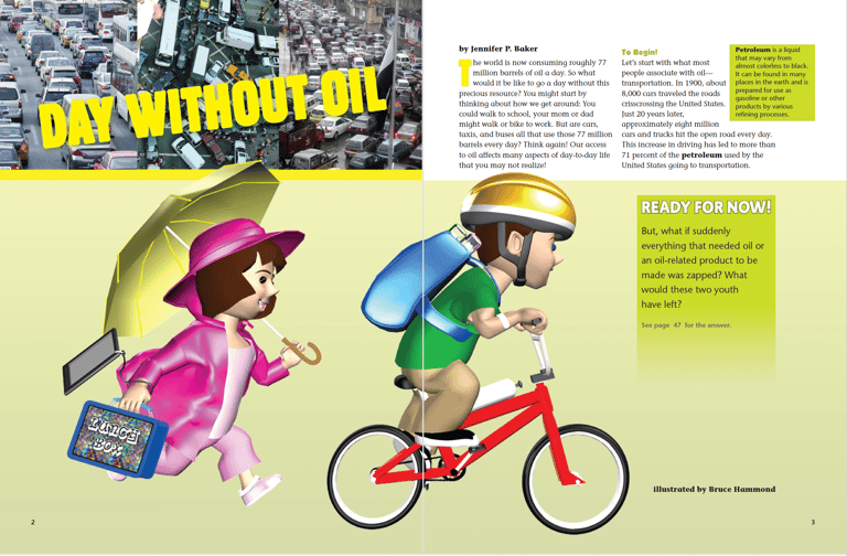
Feature Storytelling Refresh
Expanded editorial storytelling through custom illustration, art direction, and integrated page architecture. Commissioned artwork created more immersive learning experiences while strengthening visual engagement.
BEFORE
AFTER
Visual Feature System
Developed a more flexible feature framework that supported photography, illustration, and typography-driven storytelling while maintaining a cohesive editorial voice across diverse historical topics.
ODYSSEY Magazine Redesign
PUBLICATION REFRESH & EDITORIAL MODERNIZATION
Modernized Odyssey's visual identity through a comprehensive redesign of cover architecture, typography, feature systems, and visual storytelling. The refresh established stronger hierarchy, improved navigation, and created a more contemporary experience for middle-grade readers.
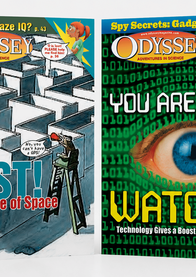
BEFORE
AFTER
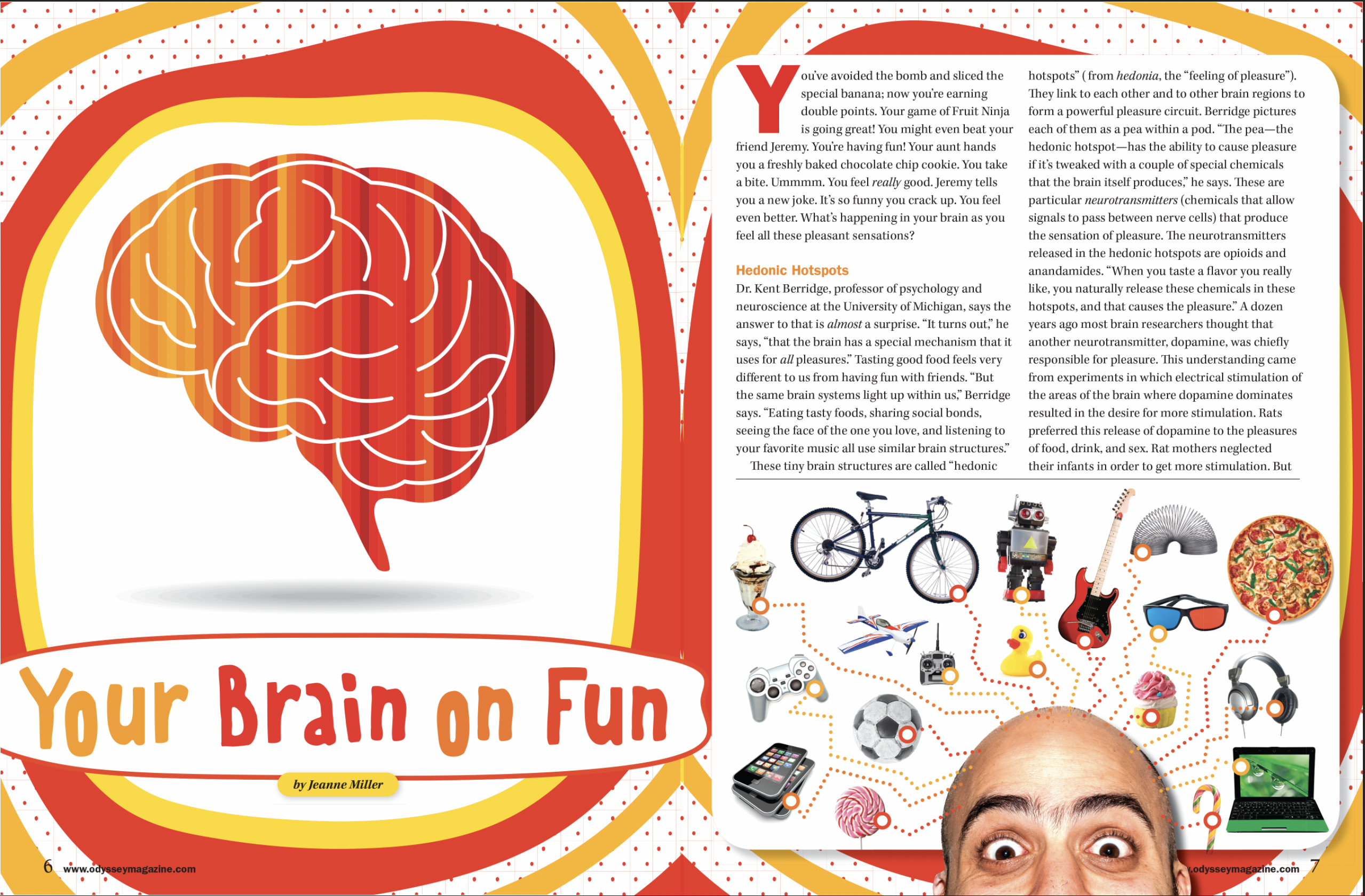
Visual Feature System
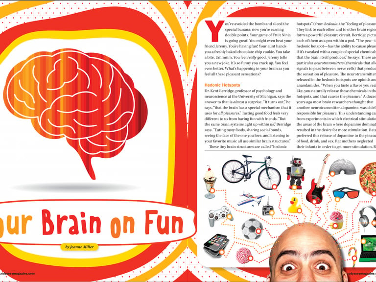
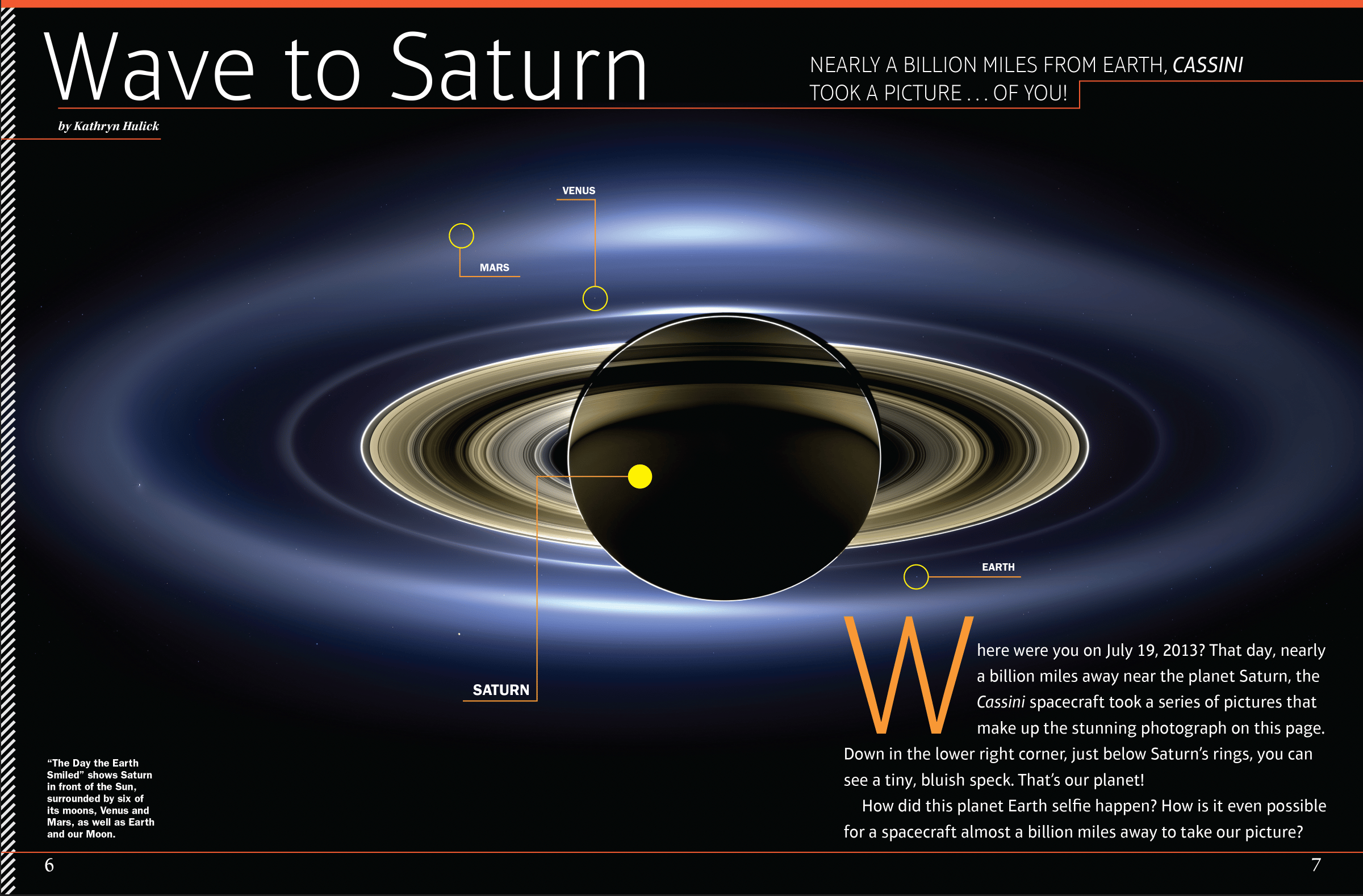
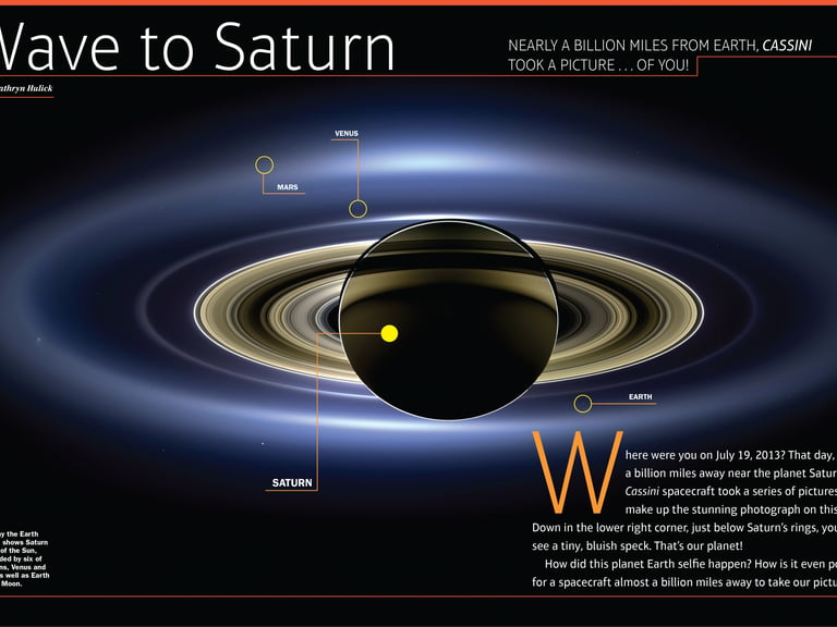
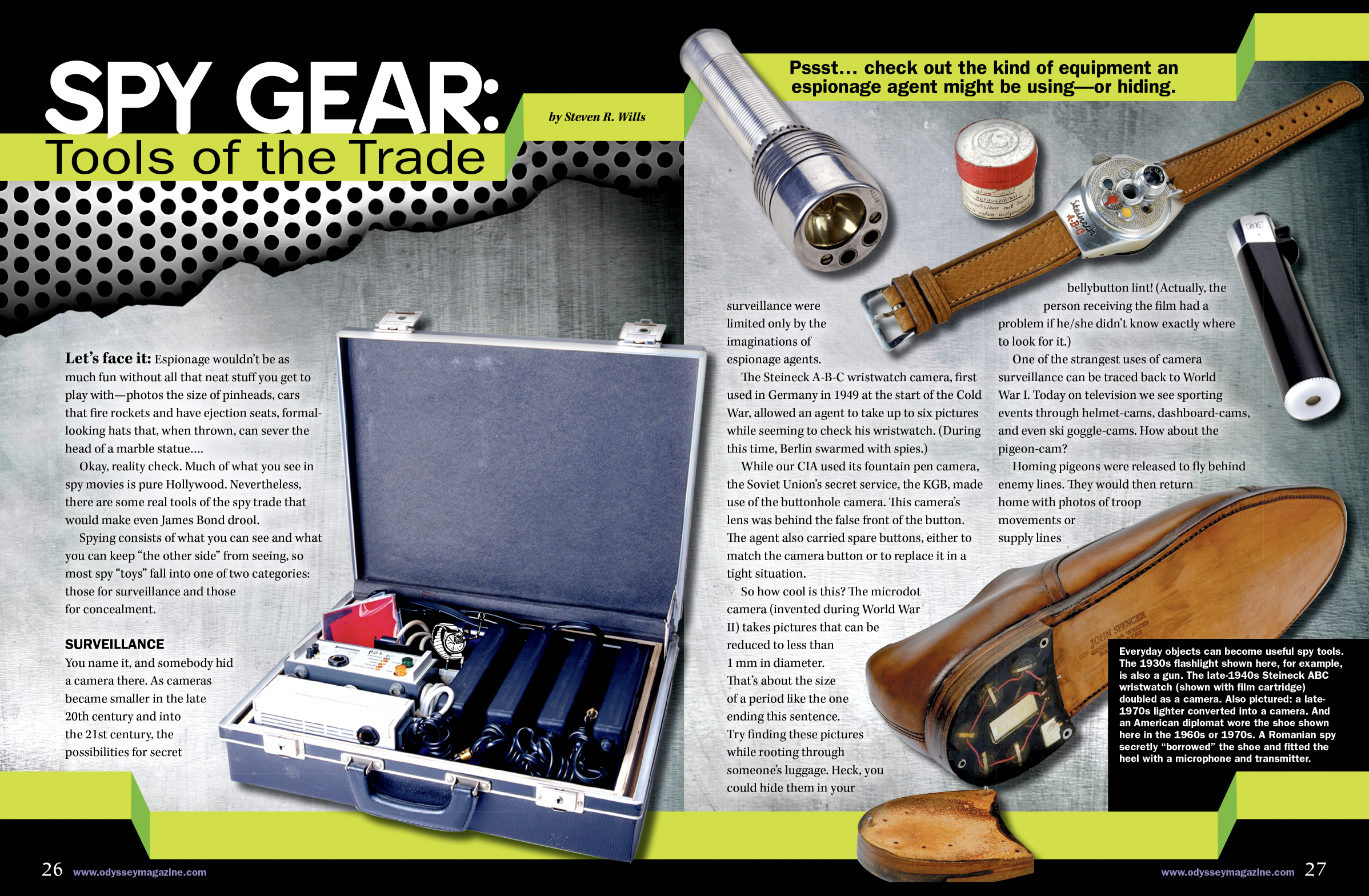
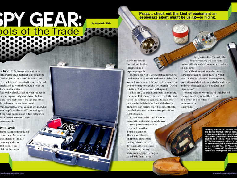
Developed a flexible feature architecture that adapted to science, technology, and human-interest stories while maintaining a consistent visual identity. Established scalable typography, stronger hierarchy, and article-specific visual systems that increased engagement without sacrificing editorial clarity.
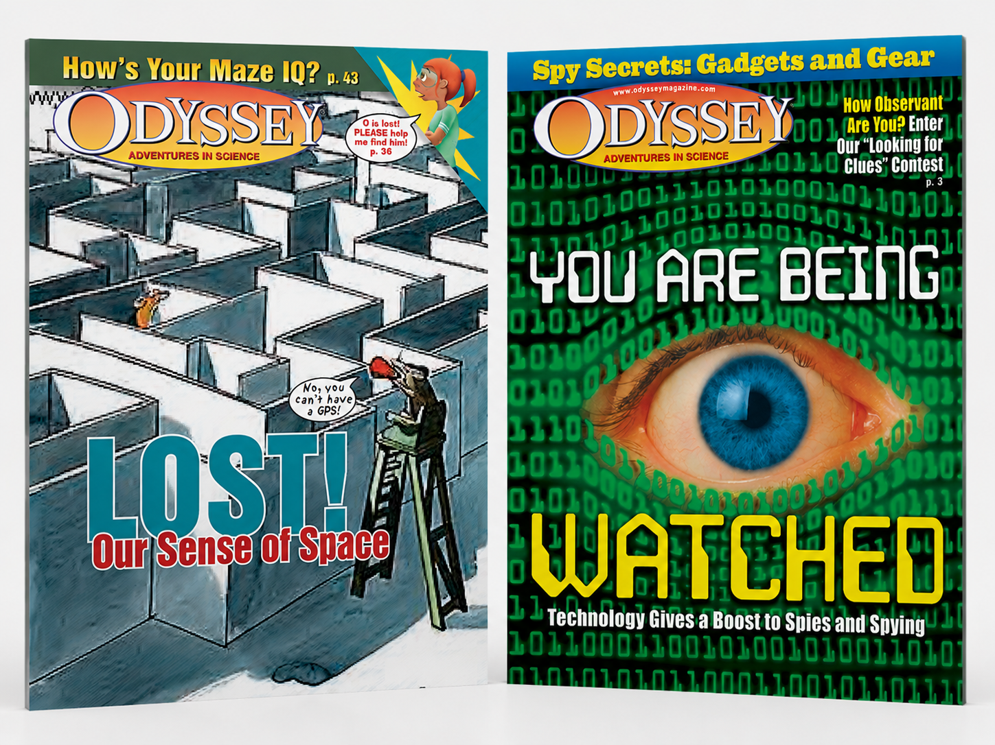
Cover Architecture System
Simplified the cover structure by reducing competing promotional elements, strengthening feature-story focus, and creating a more cohesive visual hierarchy. The redesigned covers prioritized a single compelling concept while maintaining Odyssey's recognizable brand presence.
15+
250+
200+
23
Leading art direction, editorial design, and educational publishing initiatives.
Designed and art directed award-winning magazines, special editions, and educational publications.
Created cover concepts and visual systems for national educational publications.
21 Gold Awards and 2 Silver Awards
Years Leading Art Direction
MAGAZINE ISSUES
MAGAZINE COVERS
PARENTS' CHOICE AWARDS
Editorial Redesigns That Earned 23 National Awards
Led five publication redesigns and two major magazine mergers, resulting in 21 Gold and 2 Silver Parents' Choice Awards across nationally distributed educational publications.